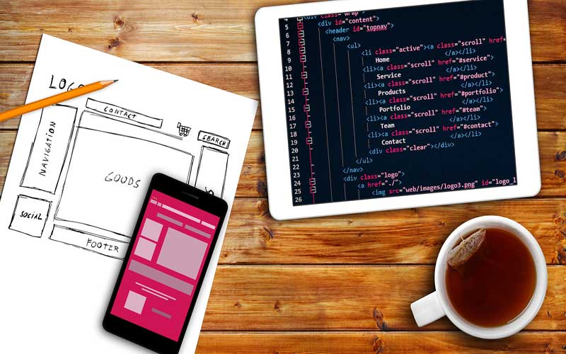
Web design is constantly evolving because the way people access the web is changing.
These days, so many more people use their iPhones to connect to the Internet, and this gives a user experience quite different from that of a desktop computer due to touch technology.
Even tablets use responsive technology, but these devices have much smaller screens, so a website that is designed to work well with a larger screen may not perform so well with a small one.
This is where and why many of the latest trends have come into being.
Some of these trends are still evolving as web designers work to make the end user’s experience a stress-free one that will encourage them to stay on the website and become a client of the business, no matter what device they use to access the internet.
Some things can’t be changed.
That said, certain functions of web design are meant to do the same thing and so cannot be changed too much. Even if they are changed to look at, they must still work in the same way.
A log-in form or a checkout must still function as they always have, guiding the user easily into performing the action required of them.
Responsive design
The latest trends in web design are aimed at making the design more responsive.
To that end, designs have become simpler and lighter while advances in data compression and bandwidth ensure the page loads quickly so surfers can find what they want quickly.
And where the user must wait, for instance, when a page is loading, the animation can be custom-designed to be attractive and entertaining, at least to some degree.
Larger scale animations include pop-up boxes to notify users of the next step and inform the user of what to do and sign-up forms. Many tell a story to keep the user on the page and inform them about a product or service.
The Pinterest advantage
Card layouts, as are seen on Pinterest, have migrated to other websites now. They are also popular because they use a small square or rectangle to present bite-sized information in a way that is easy to see and quick to read while still offering visual attraction.
Long scroll myth
Not long ago, the most important elements of a web page were placed above the fold to save people who were scrolling to find them. But now all who use the very small screens of an iPhone where long scrolling is essential have become used to it, so short scroll pages or clicking to another page for more information are not seen as desirable.
No doubt technology will continue to evolve and change into the future and many more ways of accessing internet information will be invented.

